
Project Overview
Mother is a WYSIWYG phone case site, culling various brands and marketing by style and function. Mother focuses on customer ease and providing speed at the checkout. It also supports customer well-being, providing detailed product information and safety guidelines for cell phone use in public.
THE GOAL
Design a cell phone case site flow using Adobe XD (later made responsive),
follow a desktop-first design system.
THE PROBLEM
Addressing and solving user needs when buying a phone case.
MY ROLE
Generalist / Team of 1, Brand Concept and Design, User Research, UI/UX Design, Product Research & Editing, Wireframing, Testing, Prototyping,Adobe XD
TARGET AUDIENCE
Men and Women over age 30
CHALLENGE
Transport the cell phone case buyer to the confirmation page with ease.
Understanding the User
I interviewed nine men and women, ages 30s - 70s, unmoderated online. I used the data to create an affinity map, develop personas and select topics.
FOCUS
User purchase behavior online, favorite phone case sites, products, functionality, site annoyances, satisfiers around purchasing
FIELD WORK
Empathy maps, affinity map, phone case site research
FINDINGS
Findings raised insights: How do I solve the user need for a phone case that is durable and great looking? How do I design a stylish UI with flow toconfirmation page?

"What might cause drop off when shopping for a phone case?"
“Too complicated of a site to navigate, poor layout, not a great selection of products.”
- Jade M -
Heritage Resources Historian
PAIN POINTS
SIGN IN FREEDOM
Solution
No sign in or memberships to get into the site and to make a purchase. No hurdles. After purchase, email request for confirmation must be simple.
INFORMATION OVERLOAD
Solution
Study the system of a beautiful, uncluttered site and imitate.
SELLING SYSTEM
Solution
Put collections and styles in proximity for ease of use and avoid the deep search.
CHECK OUT
Solution
Build a clear layout for ease. Include several forms of payment and a security feature.
PERSONA 1
Problem Statement: Ajay is a designer who needs to check out fast when making a purchase because he uses paypal and does not want to waste time.
PERSONA 2
Problem Statement: Jannah is a stylish, busy woman who needs a durable and attractive phone case because she drops her phone often.
JANNAH JOURNEY MAP
EMPATHY MAPS
Design Journey
WIREFRAMES
In the wireframes below, the customer must travel back and forth to see other collections, lo-fidelity testing taught me to re-iterate for ease of use.
SITE MAP

LO-FIDELITY PROTOTYPE
LO-FIDELITY USABILITY STUDY
Five men and women (30s to 60s) commented on the prototype in an online, unmoderated study. Below is a summary of the findings.
PROXIMITY
Separating styles/features from collections is confusing. Follow laws of proximity.
Do not remind the customer they are spending money, remove reference to shop.
CHECKOUT FLOW
Re-iterate checkout layout for horizontal flow and ease
of use.
CONFIRMATION PAGE
Create opportunities for the customer to make additional purchases. Add easy sign-in to email confirmation.
Finalizing Design
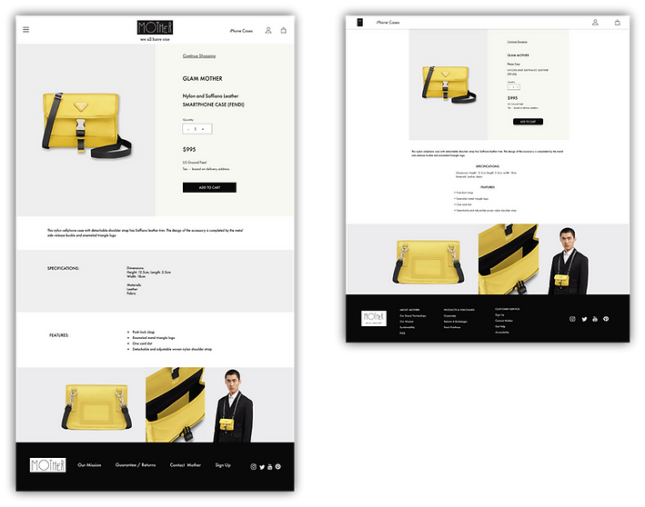
In creating Mother, my goal was to create a unique site. I developed a distinctive brand and tagline, my hero image concepts highlight the features of the product.
For design inspiration, I looked at a luxury handbag website. The homepage's scrolling layout allows users to quickly focus on the products and their features, minimizing distractions and preventing drop-off. The responsive site design was refined to improve image size and readability.
DESKTOP MOCKUPS


RESPONSIVE MOCKUPS


DESKTOP PROTOTYPE
Please test link below and return to the portfolio site.
TABLET PROTOTYPE
Please test link below and return to the portfolio site.
MOBILE PROTOTYPE
ACCESSIBILITY CONSIDERATIONS
VISUAL
High contrast for readability. Less clutter, white space for visual ease. Large images, product specifications.
NAVIGATIONAL
Site is designed for ease of use when selecting a product and the flow to checkout and confirmation.
REAL WORLD
Latest technology would be implemented to assist the visually impaired.
Conclusion
During testing, certain user aspects were highlighted that influenced the site design: immediacy, distractions and product selection.
I set out to create a website that functions like a consignment shop, bringing together different brands and organizing phone cases based on their functionality and appearance. This could potentially create selling opportunities for the brands and help customers discover new products. Additionally, I aimed to make a cost bridge by including luxury and affordable products on one page.
A personal concern of mine is mind bending phone use on stairs, walking down the street, and talking loudly in public places. I want to address the environmental and social impact of excessive cell phone use by including relevant links at the bottom of the home page. Adobe XD was a Google course requirement for this project. At present, the software is in maintenance mode, some features are not available such as creating transitions and drop down windows which I considered in final iterations.
Looking ahead, I see opportunities for growth in developing the home page and hero images, creating an interactive cart, updating with a dropdown menu for device and color options.
I am grateful for the feedback and participation that helped me gain empathy and knowledge about the phone case business. I enjoyed creating this site and learning design practices for selling.
Thank you for taking the time to read this far! Your interest is greatly appreciated.


